General
- Alerts
- Accessing CC Apps
- Ask a Question / Q&A
- Banner Message Guide
- CC Platform Data Anonymization / Wipe Process
- Client's Platform Privacy Notice - Guidance
- Cookies
- Custom CSS
- Custom Design Guidelines
- Device Compatibility and Browser Requirements
- Elements Design Requirements
- Group Management
- Hiding and Showing Content
- Language Support
- Live Poll CSS
- People Library Management
- Platform frameworks and tools our development team use
- Session Capacity
- Security Settings and Login options
- Time Zones
- Triggers
- Troubleshooting Users Accessing The CrowdComms Platform
- Using the CrowdComms Dashboard
- Wi-Fi & Data Requirements
- Whitelisting the CC Platform
- Custom Email Domains
Alerts
Alerts let you send out notifications to your delegates during an event to keep them updated on schedule changes, or encourage them to visit certain sessions for example. They are a great way to keep your attendees fully up to date with your event, and drive engagement with things like surveys or activity feeds.
Alerts can be sent as in-app popups, emails and native push notifications (if you have distributed your app as a native build via the app stores).
Preparing alerts
To start creating alerts, visit the 'Alerts' section in the dashboard by clicking the icon in the dashboard toolbar. From here you can view any alerts that have already been sent out, or create a new alert.
Enter a title and some text for your alert in the message box provided, you can elect to send your alert at a pre-scheduled time in the future or send it immediately. We recommend setting up alerts in advance wherever possible, so that the copy can be checked, or any last minute changes added before it goes out to your attendees. You can click the checkboxes underneath the description to decide how you want to send your alert. If you elect to send it as a native notification, you'll need to enter a 'plain text' version of your alert, as native notifications don't support formatting like bold or italic text.
Links
If sending the notification as a push via a native app (if you have distributed your app as a native build via the app stores) you can add a 'deeplink' action taking the delegate to a specific place within the app when they tap the alert on their device.
Deciding who will receive the alert (Recipients).
You can choose to send the alert to all users of your app, or a select few by assigning groups to the alert. If you decide to send it to a selection of groups, then those people will need to have signed in to the app at least once in order to receive the notification.
If you don't specify any groups, then the alert will go out to all users of your app, regardless of whether they have logged in or not.
For native notifications, users will need to have confirmed that they wish to receive native notifications from your app when they first open it. If they decline this permission then the app cannot deliver native notifications to that user.
Alerts sent via email will go out to any designated attendees regardless of whether they have logged into the app yet and can be especially useful for pre-event communication. They follow the same rules as other alert types, so will go to all your attendees if you don't specify and specific groups in the alert settings.
Delivery
Alerts are usually sent out as soon as they are due but with all things on the internet, they may take a little while to arrive. This can be down to a number of factors including available capacity on the platform and internet speeds at the event venue. If you're experiencing any issues sending alerts out, contact your account manager who'll be happy to assist.
Accessing CC Apps
Introduction
There are multiple ways to access your CrowdComms event platform. Each access method has its merits, our recommendation is to give your audience choice. By allowing your attendees to access on the device of their choice, via a simple custom URL or by downloading an app, the result is an easy to access platform that results in high levels of uptake.
Web Apps

To access a web app, you just visit a web link (URL), such as myapp.com. We can set this domain to be anything you'd like - so long as it's available! Then, to save the app to your device's home screen, simply bookmark the URL and the app icon will be visible for easy access, just like any other app.
This same web link can be used to access the app on laptops, desktops, phones, tablets and any other device with a web browser. (A full list of supported web browsers the CC platform supports can be viewed here.) This can make it easy for users to return to your app when they're back on their computer after the event to complete a survey or post comments in an activity feed.
There's no additional time or financial costs when going with a web app, so as soon as the app is designed and full of content, you can launch right away!
Pros of Web Apps |
Cons of Web Apps |
|
One link for all devices: works on mobile, tablet, laptop and desktop |
Push notifications not supported - email alerts work best with web apps |
|
Custom app icon and URL |
Some organisations prefer having an App Store and Google Play store listing page |
|
App can be launched immediately after all content is added - no delays by the native submission process |
Native: "CrowdComms" Container App

CrowdComms container app is our own native app which can be downloaded and used to provide the benefits of native without the associated costs and extended timeline to submit your event to the app stores. You can download this by searching 'CrowdComms app' in Apple app store or Google Play.
Pros of the CrowdComms Container App |
Cons of the CrowdComms Container App |
|
Native & Included in all packages |
No custom app name or icon available |
|
Push notifications supported |
|
|
No additional cost or time penalties (no app store submission needed) |
|
|
App can also be accessed as a web app |
Native: Branded Apps
More information about the native submission process and requirements for branded native apps can be found here.
There are 2 types of branded native apps - standalone apps and portals. A standalone app is a single app, submitted to the app stores. A portal can house multiple apps, making it a more cost and time efficient option if your organisation or client has multiple events as you can use a single branded portal and have multiple apps within it. As your account manager or get in touch if you have any questions!
Pros of Branded Native |
Cons of Branded Native |
|
Push notifications supported |
App store accounts must be set up by end client |
|
App can have bespoke name and icon |
Additional time and costs associated with native - getting developer accounts setup if applicable, granting us access to those accounts, then the time for Apple to approve the app
|
|
App has page in App Store and Google Play Stores |
|
|
App can also be accessed as a web app |
The launch process of a native app usually happens in two stages:
- Submit an app to the app stores with finalised icon, splash screen and store listing details (these can't be changed later), but with dummy content inside the app if finalised content isn't yet available
- Once the app is approved and live in the stores, replace the dummy content with the finalised content - then the launch can happen!
Ask a Question / Q&A
The Q&A feature of our app is one of our highlight features. Below is a video showing how Q&A works!
Show All Submissions on Mobile Device
This setting is on by default. When toggled on, every user in the app will see all moderated on questions submitted by all users when visiting the Q&A page.
When toggled off, a user will only see the questions they've submitted themselves in the app (provided they've been moderated on). For example, if user A submits some questions and user B submits some questions, they will each only see their own questions.
This allows a level of privacy between users as there is no visibility as to what other people have asked.
Banner Message Guide
- To create a banner message on the Front End of the app, login to CMS, locate the application and navigate to settings>banners. This will default to the “Banner Adverts” tab.

- Select the “Banner Message” tab to navigate to the Banner Message options.

- To enable a banner message to appear on the Front End move the toggle bar to active for the “Show banner message”. This will allow the “Message” section to be editable.

- Using the “Message” box input any required text, images, files, etc. that you need to be displayed on every screen of the Front End.
- If you wish for the users to have the ability to dismiss the banner move the toggle bar to active for “Allow banner to be dismissed by user”. This will generate a “Dismiss” button on the banner, which when selected will remove the banner from all modules on the Front End until next login.

- When you are happy with content of your banner message click on the “save” button. A banner will briefly display providing confirmation your changes have been saved successfully


- Login to the Front-End application and you will see the Banner message displayed at the bottom of each module using the same colour defined within the Branding for the Accent and Text on Accent. If applicable a button to “Dismiss” the banner is present.


CC Platform Data Anonymization / Wipe Process
6 Months after platform end date, all PI data is wiped from the app, but “content” remains in place and platform still visible on CC Dashboard. Users can no longer login as their email addresses will be anonymised. Here is a breakdown of what gets anonymised:
- delete association between user profile and user account (email / password)
- first_name
- last_name
- job_title
- company
- about
- address
- phone
- website
- alias
- profile_picture
- uploaded documents
- social media
- custom fields
- notes
12 Months after platform end date, the project is archived and hidden the from CC Dashboard.
Note: this process happens automatically by the CC Platform and cannot be reversed. To ensure no data is lost due to this, keep an eye on the 'End Date' in the main app settings area and ensure the date doesn't become 6 months old if the platform needs to remain live / not wiped!
Client's Platform Privacy Notice - Guidance
We have made the process regarding privacy notices simpler and easier to use. Rather than requesting a CrowdComms support resource to up date the privacy notice, this can now be done directly via the CMS.
CrowdComms’ clients are data controllers of the personal data collected from individuals who attend or speak at events hosted on the CrowdComms platform. We call these individuals “Attendees”.
If the CrowdComms client is data processor (e.g. an event management company) then their end client is the data controller.
CrowdComms is a data processor of this personal data – we process this data on our platform on behalf of our clients.
Under UK data protection laws, data controllers must notify data subjects (in this case, the Attendees) of who they are, what they do with data subjects’ personal data and data subjects’ rights, for example, to request erasure of their personal data. Data controllers must provide this notification to data subjects at the time their personal data is collected from them.
We call the notice that data controllers must provide to data subjects a “Privacy Notice”.
To help our clients fulfil their notification obligations to Attendees we arrange for a pop-up box to appear when Attendees log into the event platform. This pop-up box contains wording about privacy and a link to a Privacy Notice.
All clients should have their own Privacy Notice which we can link to. However, we have created a Privacy Notice that our clients can use (a “Client’s Privacy Notice”) if they do not have a Privacy Notice of their own or if they would rather use our version.
Please note: clients use our Client’s Privacy Notice at their own risk. CrowdComms makes no representations, warranties or guarantees that the Client’s Privacy Notice is fit for purpose or that it complies with relevant data protection laws and, to the maximum extent permitted by law, CrowdComms disclaims and excludes any liability in respect of its contents. Clients should consider the contents of the Client’s Privacy Notice carefully to ensure that it is appropriate for them, make any necessary changes and take legal advice on its contents.
Cookies
Cookies on CrowdComms Apps
CrowdComms uses cookies to enable standard analytics and error reporting. We do not store or share any personal data in cookies. Below is a list of the cookies in use:
Google Analytics
We use standard GA tracking cookies on all apps. These allow us to track pageviews and events like viewing documents or agenda items. All data sent to GA is anonymous. For specific information, refer to Google's documentation.
https://developers.google.com/analytics/devguides/collection/analyticsjs/cookie-usage
MUX Data
Mux provide video hosting and streaming services for CrowdComms. We also use their data services to track things like how many views a video has received, how long users watched videos for and things like the user experience score. MUX also tracks rough geographical locations of viewers. MUX cookies store an anonymous user ID that is used internally by MUX to differentiate views.
Sentry.io
We use sentry to track issues with the platform, including logging errors and performance metrics. Data sent to sentry is anonymized. Sentry may create cookies during usage of the app if an issue occurs but this is not always the case
Custom CSS
IMPORTANT NOTE:
There is an updated version of the CSS snippets doc at: https://docs.crowdcomms.com/books/css-snippets-24
Our platform was born with high customizability and branding in mind. Custom CSS can make your event website or app truly unique and allow your brand to shine through. "What is CSS?" I hear you ask... From Wikipedia:
Cascading Style Sheets (CSS) is a style sheet language used for describing the presentation of a document written in a markup language such as HTML. CSS is a cornerstone technology of the World Wide Web.
Leaning on our Design Team, or having some knowledge of CSS and jumping in yourself, you’ll be able to offer a truly unique and visually appealing event app design that will elevate the value of your event to your guests.
Handy Snippets to Get Started
Questions or Want Something Added?
Tap here to send a request for a new snippet!
Every CrowdComms app includes some Custom CSS added by our design team - and for common requests, we have a selection of CSS Snippets that can be added to your project to achieve your goals.
Things we can use CSS snippets for:
Removing My Schedule
Hiding extra features to keep your app simple is one of the best uses of CSS. Here's a snippet that removes the ability for users to add sessions to their own individual "schedule". This is useful when you're using our "Managed Schedules" feature to show a unique
Note: this snippet removes "My Schedule" from every agenda within your app. If you need it removed from just a single specific agenda, ask the team for help!
/*---------- Hide My Schedule ----------*/
.my-schedule,
.cc-schedule-all,
.calendar-item__ticket {
display:none!important;
}Changing Stock Wording
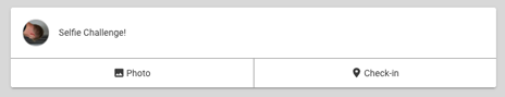
Example: Changing the stock wording on an activity feed. Instead of saying "What's on your mind?", this changes the text to say "Selfie Challenge!".
/*Change Placeholder Text on Activity Feed*/
.cc-module-XXXXX cc-activity-feed-submit-post .feed-submit-post__item > ion-label {
font-size:0px;
}
.cc-module-XXXXX cc-activity-feed-submit-post .feed-submit-post__item > ion-label:before {
content:"Selfie Challenge!";
font-size:16px!important;
}
/*Change Placeholder Text on Activity Feed Popup*/
/*WARNING - this changes for the entire app, not just one module*/
.post-input .ql-editor.ql-blank:before {
content:"Selfie Challenge!"!important;
}Before

After
Change wording for 'Speak to an expert'
/*---------- Change the Speak to an Expert Text ----------*/
cc-company-detail-section[header="COMPANIES_COMPANY_SPEAK_EXPERT"] h1 {
font-size:0px;
}
cc-company-detail-section[header="COMPANIES_COMPANY_SPEAK_EXPERT"] h1:before {
font-size:24px;
content:'xxxx';
}Simply replace the 'xxxx' on line 9 with your replacement text
Hide Online Indicator
/*---------- Hide online indicator ----------*/
cc-online-status {
display:none!important;
}Setting Custom Fonts
There are different ways to set custom fonts within the CrowdComms platform. Using Google fonts, you can select a font and use the @import CSS snippet to import it. Then you can use the "Set Font" snippet to set the font that way. Below is an exmple:
/*---------- Font Import ----------*/
@import url('https://fonts.googleapis.com/css2?family=Montserrat:wght@300;400;500;700&display=swap');
/*---------- Set Font ----------*/
html, body, p, textarea, input, span:not(.vjs-icon-placeholder):not([class*="material-icons"]) {
font-family: 'Montserrat', sans-serif!important;
--ion-font-family: 'Montserrat', sans-serif!important;
}
/*---------- Bold Headings ----------*/
h1, h2, h3, ion-card-title, ion-card-title span, span.session-title {
font-weight:700!important;
}
Alternatively if you have the font files yourself, you can upload font files to the CC Dashboard and use Custom CSS to set the fonts as the below example shows. To upload fonts, head to the Settings > Branding > Fonts area, and ensure the filenames of your fonts are consistent. We suggest using the following formats of fonts for maximum compatibility:
- ttf
- woff
- woff2
/*--------- Custom Font Import ----------*/
@font-face {
font-family: "FONTFAMILY";
font-weight:FONTWEIGHT;
src: url("https://media.crowdcomms.com/media/apps/SHORTCODE/fonts/FONTFILE.ttf") format("truetype"), /* Safari, Android, iOS */
url("https://media.crowdcomms.com/media/apps/SHORTCODE/fonts/FONTFILE.woff") format("woff"), /* Modern Browsers */
url("https://media.crowdcomms.com/media/apps/SHORTCODE/fonts/FONTFILE.woff2") format("woff2"); /* Modern Browsers */
}
html, body, p, textarea, input, span:not(.vjs-icon-placeholder) {
font-family: "FONTFAMILY", sans-serif !important;
--ion-font-family: 'FONTFAMILY', sans-!important;
}Replace "FONTFAMILY", "FONTWEIGHT", "FONTNAME", "SHORTCODE" and "FONTFILE" in the above snippet before pressing save.
Adding a Note at the top of Pages
/*---------- Add Message to the top of a module page ----------*/
.cc-module-xxxx .container:before {
content:"xxxxxxxxxx";
display:block;
text-align:left;
margin-bottom:16px;
white-space:pre-wrap;
color:black;
background-color:white;
padding:20px;
border-radius:5px;
}/*---------- Add Note to Top of Info Page ----------*/
.cc-module-XXXXX cc-info-page-list ion-list:before {
content:"Search by Name, Job Title or Company:";
display:block;
text-align:center;
margin-bottom:16px;
font-weight:700;
color:white;
}Only show the banner ad on the sidebar
/*---------- Banner Ad only on Sidenav ----------*/
cc-banner-ad {
display:none;
}
.menu-left cc-banner-ad {
display:block;
}Remove background image on people cards
/*-------- Remove people BG blur -------*/
div.people-card__header-background,
.people-card__header-background-container {
background:var(--cc-primary-color)!important;
}Company module in three columns on desktop
/*----- Companies in columns of 3 -----*/
@media (min-width: 890px) {
cc-companies-list ion-col {
width:33%!important;
max-width:500px!important;
flex:initial!important;
}
}Show company banners on mobile
/*---------- Show Company Banners Mobile ----------*/
.company-detail__background-strip::before {
content: unset!important;
}Setting up Heading 6 to be a Button
/*---------- H6 Button ----------*/
h6 a {
padding:10px;
text-align:center;
margin-block-start:0px;
margin-block-end:0px;
border-radius:4px;
font-size:1.1em;
text-decoration:none!important;
text-transform:uppercase;
background-color: var(--ion-color-accent)!important;
color: var(--ion-color-accent-contrast)!important;
cursor:pointer;
transition:0.4s;
display: block;
line-height: 1.4;
}
h6 a:hover{
background-color: var(--ion-color-accent-contrast)!important;
color: var(--ion-color-accent)!important;
}Setting up Scrollbar Design
/*--------- Scrollbar ----------*/
/* width */
::-webkit-scrollbar {
width: 6px;
transition:0.4s;
}
/* Track */
::-webkit-scrollbar-track {
background: rgba(255,255,255,0.2);
}
/* Handle */
::-webkit-scrollbar-thumb {
background: rgba(255,255,255,0.4);
}
/* Handle on hover */
::-webkit-scrollbar-thumb:hover {
background: rgba(255,255,255,0.6);
}Text Editor Image Sizing
By default, the app ensures that any image added into the WYSIWYG text editor are full width. Sometimes it's nice to have the images at their real size, especially if you're adding small images.
The problem here is that we can only have one default. This snippet changes the default so images are their regular size, rather than being forced to be full width!
/*--------- Info Page Image Auto Sizing ----------*/
.wysiwyg-content img {
width:auto!important;
}Hide banner ads everywhere apart from the Sidemenu
/*---------- Hide banner ads everywhere but the sidemenu ----------*/
cc-banner-ad {
display:none;
}
cc-sidebar-left-list cc-banner-ad {
display:block;
}Hide Banner Ads from Left Sidemenu
The below snippet hides the CC Banner Ads from just the left sidebar, so the ads are only visible in the main app page area.
/*---------- Hide banner ads from the sidemenu ----------*/
cc-sidebar-left-list cc-banner-ad {
display:none!important;
}Show mobile banner for company profiles
/*---------- Show mobile banner for company profiles----------*/
.company-detail__background-strip::before {
content: unset!important;
}Hide Version Footer
/*---------- Hide Version Footer ----------*/
.version-footer {
display:none;
}Before and After


Hide the Picture in Picture Button
/* Hide PIP Buttons */
cc-page.cc-session-page-XXXXXX cc-agenda-session-livestream-video button.vjs-picture-in-picture-control,
cc-page.cc-session-page-XXXXXX cc-pip-button
{display:none;}Make Something Not Clickable
In the below example, a session with is XXXX is made no longer clickable.
/* Make Something Not Clickable */
ion-item.cc-schedule-list-item-XXXX {
pointer-events: none;
}Edit Message on Login Screen After Failed Login Attempt
Usually when an email address isn't allowed access to a platform, there is a generic message displayed to the user informing them that they are not authorised. If you'd like to change that message to a custom one, use the below snippet:
/* Customise Login Page Failed Attempt Text */
cc-login-form > ion-card > ion-card-content > form > div.login-form__access-denied-text {
color:var(--ion-color-danger)!important;
font-size:0.1px!important;
}
cc-login-form > ion-card > ion-card-content > form > div.login-form__access-denied-text:before {
font-size:16px!important;
line-height:2em!important;
width:100%!important;
color:white!important;
background:var(--ion-color-danger);
word-wrap:break-word;
padding-top:12px;
padding-bottom:12px;
content:"Custom Message Here";
}Add a Message to Login Screen
Want to add a little note to the login screen that's always visible? This is the snippet for you.
/* Add a Message to Login Screen */
cc-login-form form:before {
content:"Add your custom message here!";
white-space:pre-wrap;
margin-bottom:16px;
text-align:center;
width:100%;
display:block;
}Allow Previously Sized Company Logos
Used the platform for a while and found the new company logo size change annoying? There's a video on our Video Guides area, plus a handy CSS Snippet below which you can copy / paste to adjust the styling on the Company Profile page.
/*Adjust size of new company logo if old sized company logos are used*/
.company-branding img.company-branding__logo {
border-radius:0px!important;
background:none!important;
border:none!important;
width:240px!important;
}Improve Alert Popup Styling
The "popup" platform alerts appear styled quite differently to the email alert popups. The below CSS helps ensure the styling is more consistent between the two.
/*Fix Alert Styling*/
cc-alert-list-item div.wysiwyg-content {font-size:14px;}
cc-alert-list-item div.wysiwyg-content ul {margin-block: 0px;}
cc-alert-list-item > ion-item > div > ion-label > span p,
cc-alert-list-item .wysiwyg-content p,
cc-alert-list-item .wysiwyg-content ul {margin-bottom:16px!important;}Change Chat Label on people profiles
With this snippet you can edit the text used for the 'Chat' button on people profiles
/*-------- Chnage Chat Label ---------------*/
cc-chat-footer ion-label {
font-size:0em;
}
.cc-person-button.chat-button ion-label {
color:transparent;
}
cc-chat-footer ion-label:before {
font-size:0.62em;
content:'Message';
}
.cc-person-button.chat-button ion-label:before{
color:white;
content:'Message';
}Video Library Edits
This block contains several snippets
/*---------- Video Library Background ----------*/
.vod-shell__content-container {
--background:#000!important;
}
/*---------- Video Library Text Color ----------*/
.vod-shell__content .featured-video__title,
.vod-shell__content .featured-video__description,
.vod-shell__content .featured-video-banner__metrics__text,
.vod-shell__content .video-card__header__title,
.vod-shell__content .video-card-group__controls__title,
.vod-shell__content .video-card__metrics__text,
.vod-shell__content .vod-section-banner__text__title,
.vod-shell__content .vod-section-banner__text__description,
.vod-shell__content .section-group__title{
color:#fff!important;
}
/*---------- Video Library Icon Color ----------*/
.vod-shell__content .featured-video-banner__metrics__icon,
.vod-shell__content .video-card__header__duration,
.vod-shell__content .video-card__metrics__icon {
color:#0000ff!important;
}
/*---------- Video Library Hide Search Bar ----------*/
.vod-shell__content cc-search-bar {
display:none!important;
}
/*---------- Video Library Hide Views/Likes ----------*/
.vod-shell__content .video-card__metrics,
.vod-shell__content .featured-video-banner__metrics {
display:none!important;
}
Iframe In Poll
Paste this into the Custom CSS, replacing the xxx's with the session number
/*---------- Embed into Live Poll Intermission ----------*/
.cc-session-page-xxxxxxx cc-poll-intermission, cc-poll-intermission ion-card > div {
width:100%!important;
}
.cc-session-page-xxxxxxx cc-poll-intermission ion-card iframe {
border:none!important;min-height:550px!important;
}
.cc-session-page-xxxxxxx cc-poll-intermission > div > ion-card {
margin:0px!important;
padding:0px!important;
box-shadow:none!important;
}
.cc-session-page-xxxxxxx cc-agenda-session-poll-tab > div {
justify-content:flex-start!important;
}
.cc-session-page-xxxxxxx .ql-video {
border:none;
}Paste this snippet into https://wordtohtml.net/ replacing the xxx's with the page which you would like to embed
/*---------- Iframe for Live Poll ----------*/
<p>
<iframe class="ql-video" frame-border="0" allowfullscreen="allowfullscreen" src="xxxxxxxx" min-width="100%" width="100%" height="100%">
</iframe>
</p>Convert Agenda Module to Posters
Just paste over the 'xxx's with the module number of the agenda you wish to convert
/*---------- Posters module ----------*/
.cc-module-xxxxxx .date-picker .swiper-buttons,
.cc-module-xxxxxx ion-footer ion-button:nth-child(1),
.cc-module-xxxxxx ion-footer .divider,
.cc-module-xxxxxx .cc-schedule-all,
.cc-module-xxxxxx .on-now-container,
.cc-module-xxxxxx cc-agenda-module-header .view-tab-bar,
.cc-module-xxxxxx .agenda-card__my-schedule {
display:none!important;
}
.cc-module-xxxxxx span.cc-agenda-date,
.cc-session-page-in-agenda-xxxxxx cc-session-speakers ion-card-title,
.cc-session-page-in-agenda-xxxxxx cc-session-documents ion-card-title {
font-size:0px;
}
.cc-module-xxxxxx span.cc-agenda-date:before {
content:'Posters';
font-size:18px;
}
.cc-session-page-in-agenda-xxxxxx cc-session-speakers ion-card-title:before {
content:'Poster author';
font-size:20px;
}
.cc-session-page-in-agenda-xxxxxx cc-session-documents ion-card-title:before {
content:'Poster download';
font-size:20px;
}
@media (max-width: 1280px) {
.cc-module-xxxxxx cc-agenda-module-header div.view-selection {
display:none!important;
}
}White on White Fix
Please note this makes all icons and elements black
/*---------- White on White Fix -----------*/
.app__split-pane.collapsed cc-agenda-card i.material-icons {
color: #000 !important;
}
cc-activity-feed-list-page * {
color: black !important;
}
.agenda-card__expand-button i.material-icons {
color: black !important;
}
cc-activity-feed-list-page i.material-icons {
color: black !important;
}
cc-meeting-booking-page {
--cc-accent-color: black !important;
--cc-primary-color: grey !important;
}
cc-poll cc-rating-poll i.material-icons {
color: black !important;
--cc-accent-color: black !important;
}
.poll__option ion-button.selected {
background: black !important;
--background: black !important;
color: white !important;
}
ion-alert * {
color: black !important;
--cc-accent-color: black !important;
}
.cc-agenda-schedule-list cc-schedule-list cc-agenda-card ion-card i.material-icons {
color: black !important;
--color: black !important;
--cc-accent-color: black !important;
}
cc-chat-panel-footer * {
color: black !important;
}
mux-player::part(captions){
--media-text-color: black !important;
}
.radio-checked {
filter: brightness(0);
}Got a Bespoke Project? Talk to Us!
Our design team will work with you to ensure that the overall design of your app supports your event goals - and gives your attendees the unique experience they're after. We've been building a custom event platforms, apps and websites for a long time and our design team loves getting their hands dirty!
Get started with a CSS tutorial - or get in contact with us today to find out how we can help bring your brand to life with a well designed virtual platform.
Custom Design Guidelines
Important: Before reviewing custom design options, we recommend considering our included template design setup -DESIGN SETUP GUIDE
Responsive Design
Our platform is designed to reflect your brand throughout across devices. This allows you're attendees to have the same on brand solution regardless of the device they choose to access the platform from. whether your users accessed on a full-sized desktop display, or a 4" mobile device - or something in the middle. Below is an example of the responsive design used throughout our apps to enable them to fill the screen with content, no matter how they're accessed.

Please find below an overview of image sizing and guidelines for various parts of your app:
HTML Homepages
App Branding
- As part of our services, we will customise the app in line with your event branding.
- To enable us to customise your app, please provide:
- An event logo and any supporting assets in vector formats (.ai, .svg, .eps).
- Relevant font files if required.
- Any supporting brand guidelines so we can be sure to we use your assets correctly. Please ensure any images are at full resolution and are not watermarked.

HTML Homepage Examples
App Icon
The app icon sits on the homescreen of your user's device, as well as the tab icon in a web app browser and represents the face of your app. It's good practice to provide this as a 1024 x 1024 px PNG file with no transparency.
You can download an example app icon with our other native imagery templates here - from the Native App Submission Details page.

The Widget Builder
In addition to the customizable HTML homepages we offer an easy to use widget-builder. This allows for predefined icons / widgets with ‘drag-and-drop’ functionality to move as required. Widget dimensions:
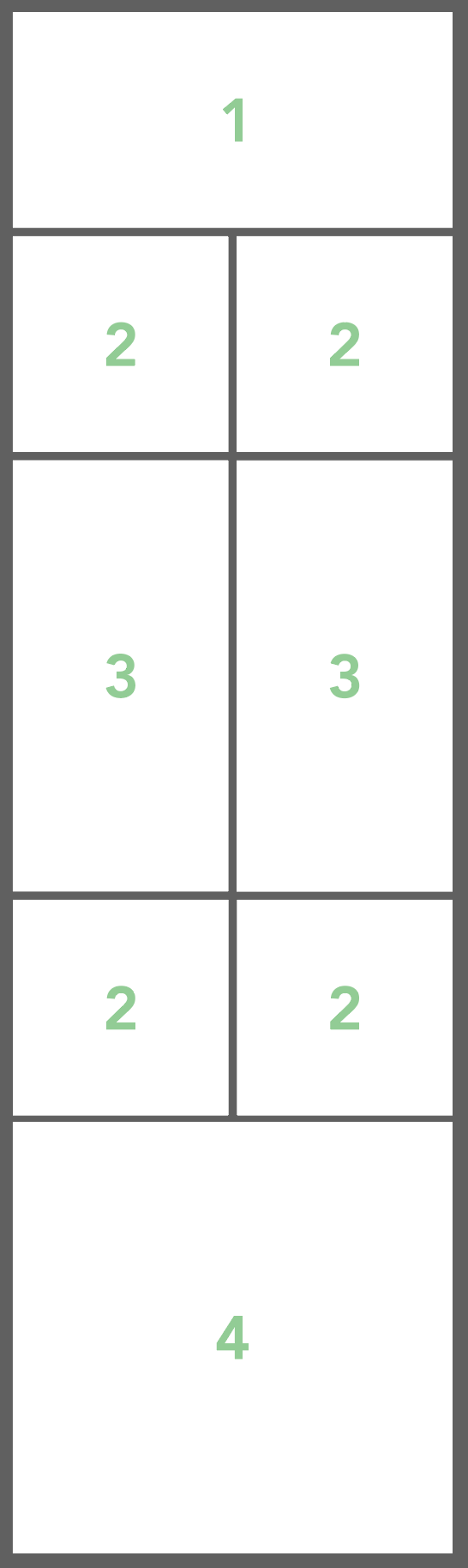
1. 816px x 400px For Long Widget Images / Titles
2. 400px x 400px For Short Widget Images
3. 400px x 800px For Tall Widget Images
4. 816px x 800px For Large Widget Images
Background Images
If you'd like to provide a background image for your app, the best practice is to provide one portrait-oriented image for mobile and one landscape-oriented image for desktop. Then, depending on the size of screen your app is viewed on, the correct background image will be shown. These images don't need to be specific sizes, however a good recommendation is 800 x 1600 px for mobile and 1920 x 1080 px for desktop. These images should be JPGs and compressed so their file size is not over 400kb each.
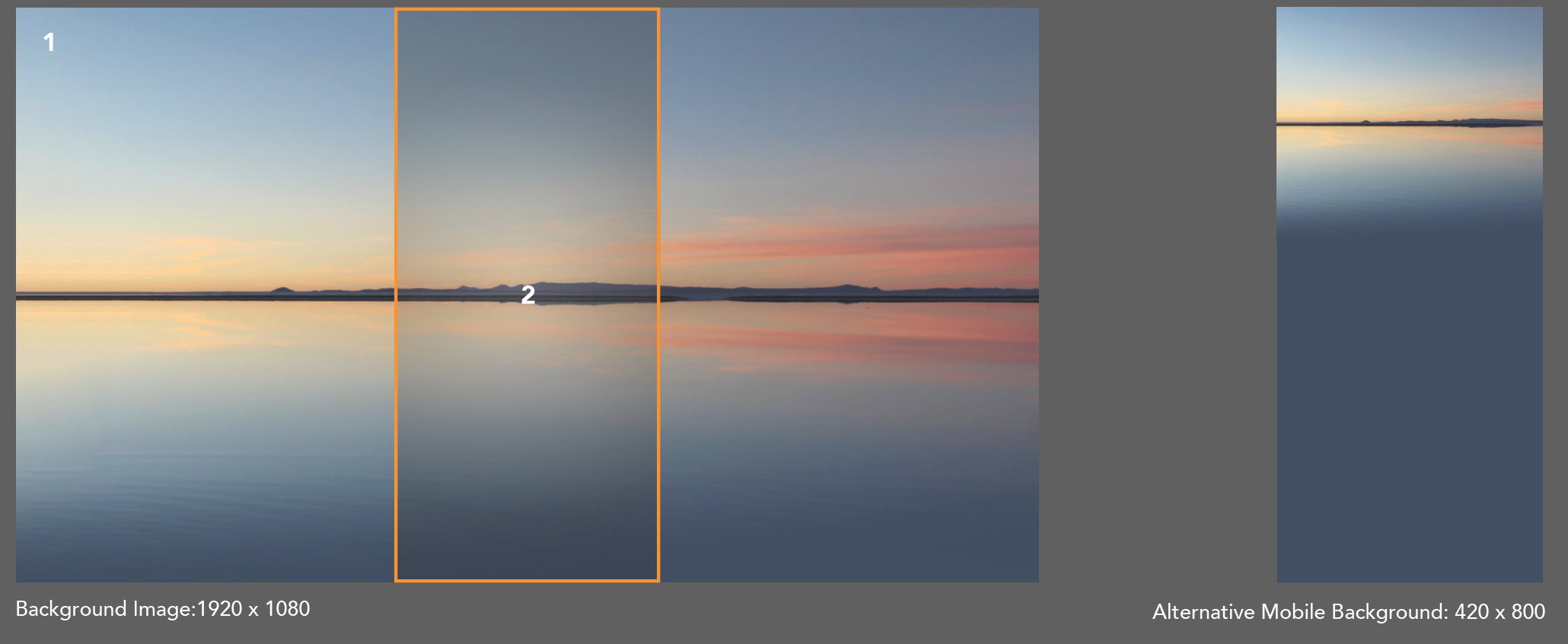
The Main App Background
This will appear behind the icons on the home screen and behind content throughout the app. We have the ability to apply the background image to specific pages only where required.
1. Showcasing the App Background Image on Desktop
2. Showcasing the same App Background Image on Mobile
Alternative Mobile Background
For some projects it can be in the best interest of the client to provide two backgrounds. This is to ensure the image is optimal across all devices including desktop and mobile. See example above on the right.
Side Menu Image & Banner Ads

The image which appears at the top of the side menu is the Side Menu Image. It should be sized 1024 x 512 px JPG or PNG file. Note: transparency is supported here!
Fonts
If you'd like to set a custom font for your app, please provide us with the relevant font files and we can set this up for you.
Custom HTML Content Pages
Images - Images inside HTML pages need to be responsive to be optimal across devices including different mobiles and desktop. With this in mind, it’s difficult to specify a specific images size. After the preferred design is mocked (see example 1), it’s best to then provide the various image assets in high resolution that are a minimum of 1920 x 1080, this will allow us to resize as required.
Icons - Please provide these assets as SVG/EPS files. As per the above, it is essential that the app is responsive across devices and therefore if these icons are provided as SVG/EPS, we can ensure we maintain clarity across devices. If this is not possible, we can work with PNG’s however SVG/EPS files are preferable.
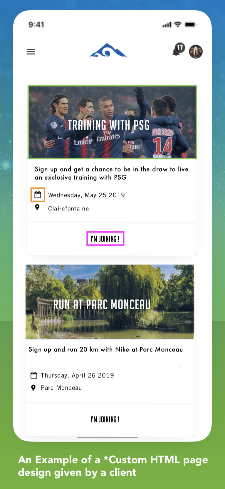
Typefaces - For Typefaces to be used in the App the client needs to provide the typeface of choice as .TTF or .OTF files. It’s important for designs that are given to us (see example 1) from the Client to also note their type usage (e.g - futura MD for titles and Gills Sans for Body text) and to provide all typefaces, no matter how common they may seem.
*Custom HTML content pages : As standard we offer a template solution with a customisable home screen. Fully custom content HTML pages require coding from a developer and are charged on a case by case basis. These type of pages are not included in standard app packages unless agreed with Account Manager. One downside of using these type of pages is that it increases the time of app setup and any changes as it’s a manual process to update the code.
Native App Imagery
If you have a native app included in your package, please click here to read our native specific requirements.
Device Compatibility and Browser Requirements
Updated; 10th January 2024
Below is a device compatibility chart for the CrowdComms platform.
|
State
|
Meaning
|
|---|---|
|
NOT SUPPORTED |
The platform may work but we do not actively focus on supporting this device or operating system. The app may suffer from glitches, poor performance or not run altogether. Often these are devices that have reached their vendor EOL (End of Life). We highly suggest upgrading as these devices are often prone to security exploits. |
|
SUPPORTED |
CrowdComms actively attempts to keep the platform running smoothly on these devices. You are always welcome to report any issues to a member of support and we will do our best to resolve these problems. |
Apple device & iOS
|
Device
|
Support
|
Notes
|
|---|---|---|
|
iPhone 5 and below |
NOT SUPPORTED |
|
|
iPhone 6, 7, 8, X, 11, 12 & 13 running iOS 12+ |
SUPPORTED |
Devices with notches will be accounted for correctly. |
|
iPad running iOS 11 and below |
NOT SUPPORTED |
|
|
iPad running iOS 12+ |
SUPPORTED |
|
Android device
|
Device
|
Support
|
Notes
|
|---|---|---|
|
ALL |
(Please click here or open the attachment to view the extensive list of supported devices) |
Android devices without Adobe PDF Reader or Chrome will not be able to open PDF Files. |
|
Android version 4 and below |
NOT SUPPORTED |
|
|
Android version 5 and above |
SUPPORTED |
We recommend Android 7 and above. Versions 5 and 6 will run noticeable slower due to falling back to a legacy webview technology. |
Windows Phone
We are no longer supporting any Windows phones and won't in the future.
Web
|
Device
|
Support
|
Notes
|
|---|---|---|
|
Google Chrome (All Chromium based browsers) |
SUPPORTED |
|
|
Firefox 5 and above |
SUPPORTED |
|
|
Safari 5.1 and above |
SUPPORTED |
|
| Microsoft Edge | SUPPORTED | Microsoft Edge version 83 (released May, 2020) and later is supported. |
|
Internet Explorer |
NOT SUPPORTED |
|
|
Firefox 4 and below |
NOT SUPPORTED |
1-2-1 Video Calls and Breakout Video Meeting - User Requirements
-
Users will need to be using up to date version of their browser
- Users should ensure that they have applications such as Teams and Zoom closed, they could stop the 1-2-1 calls or breakouts launching correctly within the platform
-
Latest versions of Chrome, FireFox, Chromium and Safari 14+ are supported
-
On IOS devices, Safari is the only supported browser
- Older browsers including Internet Explorer are not supported
Smart Sessions
Browsers must support WebGL. Browsers supported by the WebGLRenderer are:
- Firefox 15+,
- Chrome 11+,
- Opera 19+
- Microsoft Edge 83+
If you find that you still have trouble after checking the above then please check here to see if your browser settings are also compatible.
Note: We do not support Internet Explorer or Safari for Smart Sessions
Elements Design Requirements
Below is a full list of design specifications for the Entegy Platform:

Below is a list of possible places the hex code can be changed and where this displays on the platform:
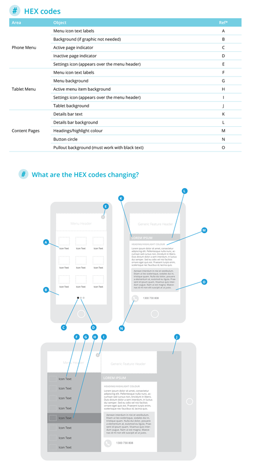
- 720 x 1600px PNG
• No transparency
• 520px clear space at top
- One graphic gets used for all devices. This means it gets cropped for smaller screens. The background gets cut from the top (it is always anchored to the bottom).
- It is recommended to avoid busy or high contrast in any background pattern or image to ensure legibility of menu item labels that will appear over the top.

- 720 x 300px PNG
• Transparency optional
- This image will require 50px of clear/safe space at the top for the Android notification bar overlay.
- The header sits over the top of the background, so it can utilise transparency.
- The update cog sits in the top right-hand corner, you can adjust the colour, but it cannot be moved.

- 1125 x 604px PNG
• Transparency optional
- This image will require 135px of clear/safe space at the top for the iPhoneX status bar overlay.
- The header sits over the top of the background, so it can utilise transparency.
- The update cog sits in the top right-hand corner, you can adjust the colour, but it cannot be moved.
- If you don't supply a tall menu header, the system will use the small header. If this occurs, the status bar will use the content page detail bar background colour.

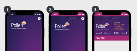
Example of the two header types on the iPhoneX:
- Screen one shows the tall asset, extending behind the status bar (a dark overlay is automatically added)
- Screen two shows the result of only uploading the stand 300px high header asset, using the content page feature bar colour behind the status bar
- Screen three shows the content page with the feature bar background colour set
Tablet screens
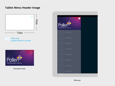
Tablet screens are made up of a header graphic and a flat colour behind the menu.
- 720 x 400 px PNG
• Transparency optional
• Phone header will be used if not supplied
Help your attendees easily find what they are after. Clear icons can improve the usability of your app. We have created a few sets that we encourage you to use or refer to, they contain a wide range of icons which cover the needs of most event apps.
- 171 x 128 px PNG
• Transparency optional
- Our templates contain solid and line versions. They have been setup in Adobe InDesign which means a master page controls the background, and object & paragraph styles control the individual icons – meaning you can change all 100+ icons in a few minutes.
- Menu icons are always loaded from left to right, top to bottom on phones and top to bottom on tablets.
- Menu icon names are created in our CMS Core. They can be renamed and rearranged at any time.
- Core has four default icon sets that can be tinted any colour to match your app design

Generic header & feature headers
These appear above content pages. A generic header appears throughout the app, but can be replaced for any page independently at any time allowing you to really add focus and functionality to each page.
Generic Header / Feature Header
- 720 x 405px PNG
• No transparency
- Allow 74px clear space at top back button (iOS) and system icons (Android).
- A generic header is needed as a default throughout the app. Feature headers can be loaded above any content page, this will replace the generic header.

Group Management
There are a few ways to manage People Groups in the CC platform:
- Manually using the Dashboard
- Using the People Excel template
- Using the Group Excel template
Please note: Group names have a maximum of 50 characters. If you try to upload a spreadsheet containing any group names over 50 characters, then it will not upload due to this limitation. When bulk uploading you can only upload 26 groups at a time.
Group Management
Group Excel Template Management
In a recent release, we added the ability to manage People and their Groups by importing and exporting an Excel template.
The format of the Excel document is as below:
| Group Name | Group Name | Group Name... |
| email or alias | email or alias | email or alias |
| email or alias... | email or alias... | email or alias... |
The group names are in the top row, and the list of users who are to be in each group are listed below, one item per cell.
Any email address or alias which is in the Group Template, but doesn't match a Person in the app's database will be ignored by the importer.
Note: whilst both People Template management of Group importing / exporting and Group Template management of Group importing / exporting are both fully working and inter-operable at the same time, it's important to remember to treat the data in the CC platform as the "truth" once an import has taken place. It's possible to overwrite data if you import an old template file to the platform after changes have been made.
In short, be sure to export from the platform immediately before any changes are made, and immediately re-import once those changes have been made.
Hiding and Showing Content
If you'd like to hide and show various content as your event progresses, your app can be built in a way to make this easy to accomplish.
Depending on the time of content you'd like to show and hide, there are different methods to make it visible. Below is an explanation for the main types. If you have any questions or would like more information added here, please drop us an email!
Modules
Each app module in the Builder menu has an Eye icon next to it - shown in the below screenshot. If the eye is fully visible, it means the module is visible in the app for users. If the eye has a line through it - like the Challenge module in the below screenshot, it means the module is hidden in the left-hand menu and won't be visible to anyone.
To change the visibility of a module, just click on the pink icon and that will change the status of the icon immediately.
Still not seeing the module? Read on!
Module Privacy is a related, advanced feature where certain modules can be set to be visible just to certain people. For example, if you'd like one "Event Info" visible to the VIP group of users and a different "Event Info" visible for the Delegate group of users, it's possible to create 2x different Event Info modules and set them up. For more information, please contact your support specialist or email support@crowdcomms.co.uk.

HTML Content
HTML modules allow bespoke pages to be created in-app. These pages are often made to enhance the design of an app to provide a very custom look. Please speak to your Account Manager or Support Specialist if you'd like any more information about the work our bespoke design service can offer.
If your app has HTML modules and you'd like to hide or show content within the module, please watch the short video below. Additionally, this guide explains how to correctly format HTML Comments.
Agenda Sessions
The agenda module has been built with the flexibility to allow certain sessions to be hidden from certain users. This feature is called Managed Schedules.
To find out more about Managed Schedules, read our guide here.
Language Support
The following languages are supported on the CC platform app for multilingual apps:
- English
- French
- German
- Dutch
- Polish
- Italian
- Portuguese
- Spanish
- Russian
- Arabic
- Thai
- Swedish
- Japanese
- Korean
- Simplified Chinese
- Traditional Chinese
- Romanian
Live Poll CSS
When customising a live poll, sometimes you may want to adjust certain aspects of the design which are not available to change as a setting. This is where Live Poll CSS comes in handy!
VW = Relative to 1% of the width of the browser window size. If the viewport is 50cm wide, 1vw = 0.5cm.
To apply any of these CSS tweaks, paste the snippet into the live poll theme CSS area and press save.
Question Text Size
The default font size of question text is 3vw. This CSS changes the size of all question headers.
span.poll-layout--header-text {
font-size:4vw!important;
}Answer Text Size
The default font size of answers on a multiple choice question is 2vw. This snippet changes the answer text and the percentage text size so they stay consistent.
span.choice-poll-title, div.choice-poll-bar--percentage {
font-size:3vw!important;
}
People Library Management
The CC Platform treats all People in-app the same, whether they're an Attendee, Speaker, member of the Event Staff or a VIP. All People to do with your app need to be added to the People Library.
If your app is set as "Secure" in the Security Settings area, the app will require users to login when they first visit it. Only users who have been loaded into the People Library within the Dashboard will be able to login. The login screen asks for an email address, so ensure you add People to the Dashboard with email addresses if they need to log in to the app.
Note: You cannot give any users of the CC Platform access to the Dashboard. Only CC Support staff members can do this - so if you'd like to give any of your colleagues admin access to your app, please get in touch.
Overview
People Lists
The people list tab contains all the users that are registered for the platform. Please see the video below for more detail about this area, and how to add/edit users manually. For bulk imports or edits, please watch the video under "Importing and Editing People in bulk".
People Groups
Once People have been added to an app they can be assigned to a group, which allows you to easily target all of those users for a variety of scenarios.
For example if you'd like to display a list of all attendees, put all the attendees in a Group called Attendees. Then, a People Display module can list all users within that group (using the people display filter). The same goes for any other way you might want to organise People within your app.
App Alerts can be sent out to specific groups, so thinking about how your app users are organised can help you define some sensible groups.
The other major use case is for locking certain modules or sessions to a group of users, which can be done by entering the Group into the relevant "module privacy" field.
Next up is a video on how to import or edit your People Groups in bulk via the spreadsheet.
Please note: Group names have a maximum of 50 characters and you can import a maximum of 26 groups at a time.
People Tags
People Fields & Custom Fields
The platform allows for fields such as Title, Email, Address and more to be toggled on and off. Below is a video on how to change update these preferences.
Import People
Importing and Editing People in bulk
Removing People
People can only be removed individually. If you'd like to delete all users from an app, please get in touch with a member of your CC support team.
Distinguishing in-person delegates
If you wish to provide different session experiences for your delegates who are either present in-person at the venue or attending the event virtually , you can do this by amending their Settings in the People Library.
You can do this individually by going into the relevant delegate’s profile and checking the ‘Attending event in-person’ box. By doing this, this delegate will not be able to watch any live-stream which has been linked to an agenda session.
You can also do this in bulk by using the import and export template that is available for download from the Dashboard. On Column Z of the template:
- Type ‘Yes’ if you want to check the ‘Attending event in-person’ box
- Type ‘No’ if you don’t want the ‘Attending event in-person’ box checked
Platform frameworks and tools our development team use
Frontend
Delegate FE (User)
- Angular 17: Core framework for the web application.
- Ionic 7: UI framework which provides "native" style components for iOS and Android.
- NGRX: State management library providing maintainable patterns for development.
- Ably: Allows for realtime websocket messages which are used for engagement, messages, alerts and notifications.
- Capacitor: Allows for compiling the web app to an Android & iOS native app using web view technologies.
- Mux: Provides components for a smooth user experience when viewing livestreams and on demand videos.
- OneSignal: Used for native push notifications to devices (when installed as native app).
New CMS (Admin)
- Angular 17: Core framework for the web application.
- NX: Monorepo build system enhancing maintainability over the codebase.
- Angular Material UI: UI framework providing core elements such as form inputs and buttons.
- Ably: Allows for realtime websocket messages which are used for updating stats in realtime.
- LiveChat: Provides the embedded 'Chat to support' widget.
Registration Suite (User)
- Angular 17: Core framework for the web application.
- NX: Monorepo build system enhancing maintainability over the codebase.
- Angular Material UI: UI framework providing core elements such as form inputs and buttons.
Video Break Outs (User)
- Angular 17: Core framework for the web application.
- NX: Monorepo build system enhancing maintainability over the codebase.
- Angular Material UI: UI framework providing core elements such as form inputs and buttons.
- Ably: Allows for realtime websocket messages which are used for updating the view in realtime.
- LiveKit Video: Realtime video library to allow the publishing and receiving of video and audio tracks in calls.
Kiosks (User)
- Angular 17: Core framework for the web application.
- NX: Monorepo build system enhancing maintainability over the codebase.
- Angular Material UI: UI framework providing core elements such as form inputs and buttons.
- Electron: Framework to generate native desktop applications, used for the printer tray software with kiosks.
Legacy CMS (Admin)
- Angular 9: Core framework for the web application.
- Angular JS: Legacy Core framework for the web application.
- Ably: Allows for realtime websocket messages which are used for updating stats in realtime.
- LiveChat: Provides the embedded 'Chat to support' widget.
Smart Sessions (User)
- Angular 15: Core framework for the web application.
- Angular Material UI: UI framework providing core elements such as form inputs and buttons.
- Ably: Allows for realtime websocket messages which are used for updating the view in realtime.
- Twilio Video: Realtime video library to allow the publishing and receiving of video and audio tracks in calls.
- PixiJS: Core rendering engine to display users, bubbles and graphics to users.
- NGRX: State management library providing maintainable patterns for development.
Backend
Main API
- Django 4.2.11: Core framework for the API.
- Amazon SES: Email service for all delegate and admin communication via the platform and CMS.
- Amazon RDS: Relational database management system.
Smart Sessions API
- FastAPI 0.x.x: Core framework for the API.
- ably 1.2.1: passing actions (eg leaving a bubble) between FE and API
Mettings API
- FastAPI 0.70.0: Core framework for the API.
Public API
- FastAPI 0.100.1: Core framework for the API.
Analytics Microsite
- Amazon Glue: main powerhouse for processing and retrieval of big data
Infrastructure
- Backend projects are hosted on AWS ECS, Frankfurt Data Centres.
- Frontend projects are hosted on AWS S3 and distributed via AWS CloudFront.
- Livestreams and on demand videos are served from Mux.
- Realtime video calling (VBO & SS) is provided from Twilio.
Associate Terminology
Codebase
Session Capacity
Sessions can now optionally have a 'capacity' added to them. By default the value is not set, meaning that any amount of people can add the session to their personal agenda and any amount of people can be added via managed schedules. If this value is set then it will be enforced when people try to favourite the session for personal agendas, and when people are added via managed schedules in the CMS. This can help to make sure the session is not over-subscribed via any method. The session should display the remaining places when viewed in the app.
Security Settings and Login options
- Public: Anyone can access via your custom URL and access without having to login.
- Important: Users will still need to login in order to watch streams and on demand videos. This is done to ensure analytics are available.
- Private: Anyone can login however they will need to login with an email address and create a password. Any email address will be accepted.
- Secure (Default setting): Only your registered users (The list of users loaded on the CMS) will be able to login with their registered email address. On first access, they will need to create their own personal password.
- Passcode - Create a generic passcode that attendees have to enter in addition to the login option you've selected. For example Secure login option and passcode would result in the below:
- User has to enter registered email address
- User creates a personal password on first login
- User then enters the generic passcode promoted to them
- Email Validation - If you opted for Private or Secure where users have to login in order to access, you can require them to click a link in their email in order to gain access to the platform. Important: For high profile events, this should be the go to setting or alternatively hide attendee list and session chat to avoid any associated risk.
Secure is the default setting and the most common option ensuring only registered users have access. Additional levels of security are often seen as over the top and result in more complex login process for users. The specific event and content requirements will determine which is the best option.
Time Zones
The only part of the app which are affected by users being in a different timezone to the one which is set in the app settings are the App Alerts / Notifications and the On Now icon which appears under “live” agenda sessions.
Any app alerts which are pre-scheduled in the dashboard will be sent out at the time / date they are pre-scheduled for in the selected app time zone. If the time zone is changed after an alert is pre-scheduled, it will still go out at the date / time that it was pre-scheduled to in the time zone when the alert was first created.
The on-now icon / badge which appears under sessions appears when the session is between the start and end date / times within the timezone of the app. It is possible to hide this badge from within one specific agenda within an app, or for all agendas which in an app.

You can now display the Agenda Sessions time on your app based on the event time zone. Imagine that you're running your event in London, with delegates attending from all around the globe. You want your Event App to show sessions in the event's time zone rather than the local time of each attendee, and by keeping a consistent time zone, delegates can arrange meetings without confusion. This feature allows for a clear understanding of when the meeting is scheduled to occur, regardless of the physical location of the attendee’s device when the meeting was initially arranged.
Upon release, this feature will be active by default. A new switch will appear on the event platform, enabling delegates to switch between the Event App's time zone or the time zone of their device.
As the event organiser, you have the option to change the default view for your user. Simply log in to your CMS Dashboard to change the default for your Event App.
Event Organiser CMS Setup to Change the Default Time Zone
1. To change the default time zone, you will need to log in to your CrowdComms Content Management System (CMS) Dashboard and input your details.
2. Upon successful login, select the relevant Event App, then navigate to Settings -> App Details, and scroll to the Localisation section.
3. On the Default Time Zone, you can either select:
a) Local time zone – If chosen as the default, your delegates will see their agenda sessions in their device’s time zone.
b) Event time zone – If chosen as the default, your delegates will see their agenda session in the event’s time zone.
Delegate’s Event Platform Time Zone Setting
1. Event App users can now view the session's time, either in the event’s time or their device’s time.
2. Upon logging in to the Event platform, navigate to the Agenda/Programme/Schedule for the event from the left-hand menu on the App.
3. If the user and/or his device’s time is currently in a different time zone to the event, they can change the time zone.
4. At the top of the Agenda/Programme/Schedule lists, users will see a toggle with the ‘My time zone’ options or ‘Event time zone’ options.
5. If the user picks:
a. My time zone – They will see their agenda sessions in their device’s time zone.
b. Event time zone – They will see their agenda session in the event’s time zone.
6. If Event time zone is selected, all the Agenda/Programme/Schedule times will be updated to show the times based on the location of the event. For example, if the event is in Berlin and the event organiser has arranged for a lunch to take place at 13:00, the app will show the time as 13:00 and the time zone of the event location, GMT+1.
7. Furthermore, when the user goes into the session page, they will see the session date and time, as well as the time zone , and when they hover over the time zone, a note will appear stating the time zone the session time appears in.
8. If ‘My time zone’ is selected, the users will see the Agenda/Programme/Schedule times converted into their device’s time. This means, if the event is in Berlin and the event organiser has arranged for a lunch to take place at 13:00, and the user is in London, the app will show the time as 12:00 and the time zone of the user, GMT.
9. When the user goes into the session page, they will see the session date and time, as well as the time zone. When they hover over the time zone, a note will appear stating the time zone the session time appears in.
10. The time zone options will also appear in ‘My Event Schedule’, which is situated on the right-hand menu.
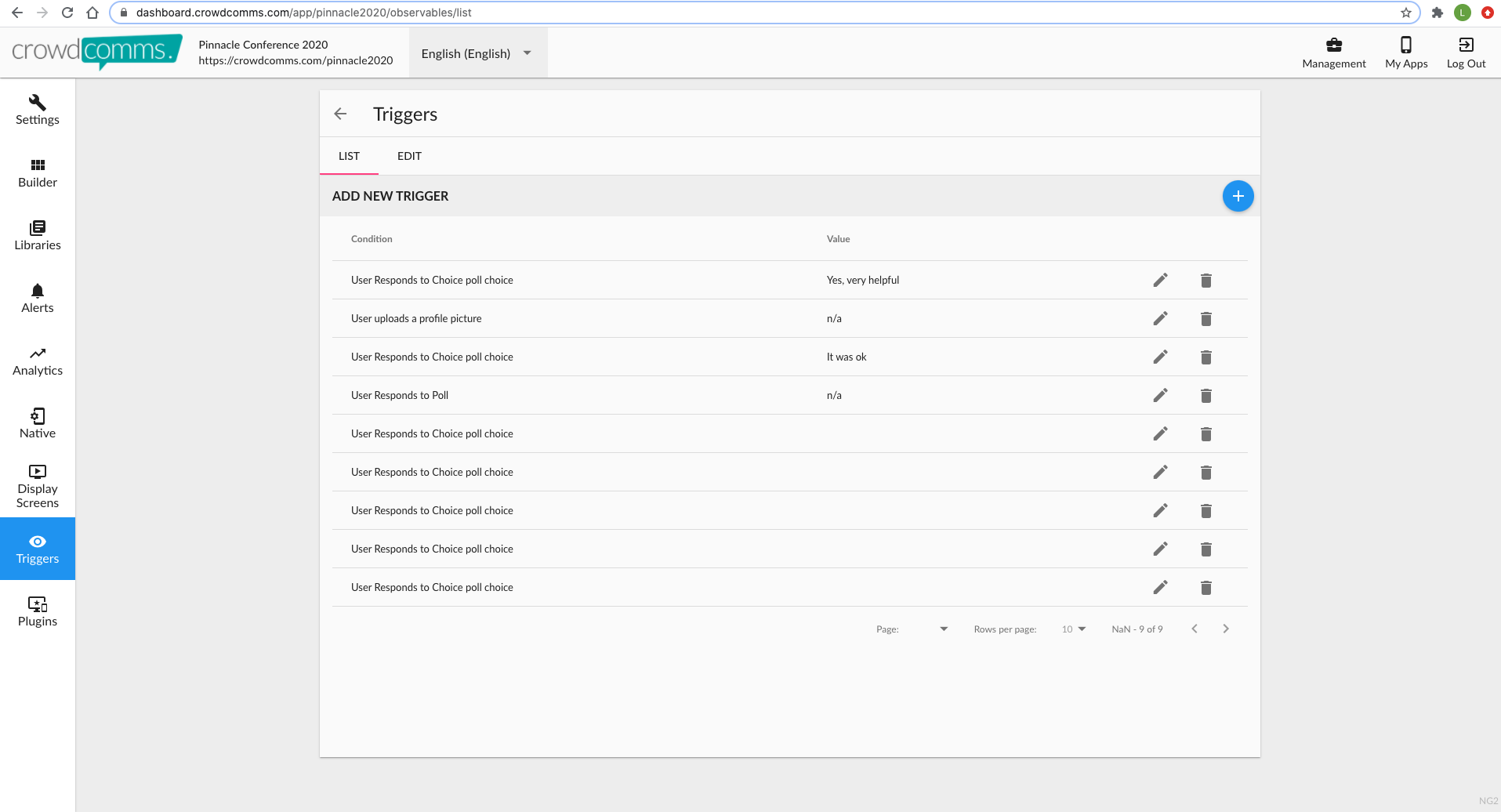
Triggers
Ways triggers can be used:
- Award points when user uploads a profile picture
- Award points when a user responds to a poll question
- Award points when a user gives a specific response to a poll question
An example of a way to use triggers (user responds to choice poll choice), is to add a question at the end of a survey which says "Would you like to receive xx free points for completing the survey" with a Yes / No answer.
It's really handy being able to automatically assign points to users who upload a profile picture.
If using a trigger to award points, make sure the gamification module has the toggle on for "Show scores for the whole app on the leaderboard ( including all modules and points awarded for triggers )" in the settings tab.
Troubleshooting Users Accessing The CrowdComms Platform
We recommend promoting the platform at least one week pre event. Promoting early ensures users are logged in and comfortable navigating the platform before the event begins.
Issues accessing the platform are rare and in most cases, quick to troubleshoot. Below you will find the most common challenges and solutions to help your users quickly get onto the platform.
-
WiFi
-
- Advise the user to check other sites are working and if WiFi isn't the issue attempt refresh or failing that clear cache and try again.
-
User is unable to login with their email: 'You are not registered to access this event, please contact an event organiser.'
-
- Check users are entering the correct email listed on the CMS, Libraries, People
- Recommend using the correct email listed on the CMS
- If user is not listed on the CMS, add the user to give them access. To do so, go to the CMS, Libraries, People, Add New Person
-
User has forgotten their password
- Recommend using the 'Reset password' option on the login page
-
Unsupported browser
-
-
For any user who has issues accessing it is always worth sending supported browsers to ensure they are using a compatible browse - https://docs.crowdcomms.com/books/platform-docs/page/device-compatibility-and-browser-requirements
-
-
Firewall stopping users from accessing the platform
- Some internal firewalls block unrecognised platforms. CrowdComms mitigate the request by ensuring all event URL's are https. In the event of the URL being blocked, the only solution is to get the relevant IT team to white list / approve the platform URL.
-
User isn't receiving automated email alerts, reset password email or verification email
- Email communications sent from the CrowdComms platform are delivered from 'appconcierge@m.crowdcomms.com'. If you intend to use this functionality, please ensure this email address is white listed by relevant IT team to avoid emails being blocked or going to spam.
-
Reporting an issue you can't resolve by checking off the above FAQ's
- If you have issues outside of the above and require further assistance, your allocated support contact or the wider support team at CrowdComms are contactable on below options:
- CrowdComms UK (+44) 01258 863812
- CrowdComms Ireland 00353 (0)65 6828919
- Monday to Friday between 9am to 5.30pm
- In order to quickly replicate the issue and provide a solution, we will need the below information. Please provide this in the first communication of any issue where possible to speed up how quickly we can provide a solution.
- User(s) email who is experiencing the problem
- Browser & version
- Device used
- Screenshots
- Steps taken to replicate the issue
- If you have issues outside of the above and require further assistance, your allocated support contact or the wider support team at CrowdComms are contactable on below options:
Please note: CrowdComms provide support to organisers however CrowdComms do not manage the communications directly with end users unless show day allocated support is included with event package.
Using the CrowdComms Dashboard
The CrowdComms dashboard is a self service content management system (CMS) that enables you to upload and make edits to content, send alerts and manage engagement functionality all in real time.
Settings
In the Settings section is where you'll find all the tools you need to configure the core parts of your app. In this section you can design the look and feel of your app, toggle features for your attendees, setup security, and add banner advertising if you wish.

Builder
The Builder section lets you setup the actual modules your attendees will use during the event. This is where most of the action happens in terms of delivering the event app experience. We have a complete guide to all the modules on offer which goes into much more detail.

Libraries
Libraries allow you to manage all the content for your app in one convenient place. Housed in this section you'll find all your attendees, documents, exhibitors, surveys, Q&A sessions etc. Use the Libraries section as a centralized place to control your content, which you can then link to various modules in the Builder section to allow your attendees to interact with it.
Alerts
The Alerts tab is where you will manage your real-time notifications sent out to your attendees. This includes emails, in-app notifications and native notifications. See our Alerts section for more details.

Analytics
Get a picture of how your attendees are using the app via the Analytics portal. Here you can view realtime metrics about all aspects of your event app, and download reports for post event analysis.

Triggers
Triggers can be used to award points to a user for answering a poll or survey or uploading a profile picture or send them directly to another area of the app.
Wi-Fi & Data Requirements
Introduction
The CrowdComms platform is lightweight in terms of data requirements however it is recommended that all users access using a strong and stable internet connection to ensure a seamless experience. Once installed (mobile app) or open in browser (web based version) on user devices, the general rule is that if there is sufficient WiFi bandwidth to allow all users to concurrently use BBC News or comparable websites, this will be suitable to provide your audience a smooth experience when using the CrowdComms platform.
A key consideration when arranging WiFi is that the specific requirements will depend on what you are looking to do at your event. To give an example, if you have other services outside of CrowdComms using bandwidth, you will need to take this into consideration when arranging WiFi.
WiFi Requirements
If interactive features such as live polling are taking place, we recommend having a minimum of 15KB (upload bandwidth) per-user, so for 500 attendees, we would recommend having a minimum 7.5MB (500x15 = 7500KB = 7.5MB) upload speed. This is based on each user voting on a question at precisely the same time, which whilst unlikely to happen, it's recommended to allow for the highest data usage scenario to ensure you are covered.
As mentioned in the introduction, if you have other data hungry services taking place alongside the CrowdComms platform, it is essential to account for this when arranging WiFi. Ideally having these services on a dedicated WiFi connection.
Users have the ability to impact the performance of WiFi. For example if your connected users (attendees etc) are using the WiFi to stream videos, are sending images on Whatsapp etc or are backing up their devices, all of this will use your WiFi allowance impacting the available data intended to allow your users to utilise the CrowdComms platform.
The mobile app version of the CrowdComms platform is typically a 3-10 MB initial download - when an attendee downloads the app for the first time only. Repeat visits will not require a download. We recommend promoting to your users pre event reducing burden on WiFi of everyone trying to download on the morning of the event. Accessing the web based version is more lightweight and doesn't require a download.
Recommended WiFi setup
- Ensure there are sufficient access points for all delegates to access the WiFi concurrently. Some delegates will be accessing the WiFi on more than one device e.g. phone and tablet
- What is the delegate experience when logging onto the WiFi? The recommended experience is a named SSID with password rather than logging in via browser. Request this from the venue.
- Ensure the WiFi does not disconnect after a certain amount of inactive time or attendees will have to keep signing in
- There needs to be enough bandwidth for users to comfortably browse the internet and send and receive emails. Some venues might restrict bandwidth to each device, in this case we recommend a minimum of 3Mb per device. In practise lower bandwidth can comfortably support the CrowdComms platform, 3Mb per device ensures ample data for all users to have a seamless experience.
- Important: It is essential to do speed tests (https://www.speedtest.net/) to ensure the WiFi is as communicated by the venue. This needs to happen before the show begins to allow the venue to troubleshoot any issues.
Session Engagement: Must Haves
- For interactive live displays to show the results on digital displays around the venue for live polling, Q&A, and Game leaderboard, this requires a hardwired internet connection accessible from the AV desk (dedicated minimum of 3 Mb up and down).
- In practise, the results displays will update on WiFi however to ensure a smooth experience we highly recommend having hardwired internet connection with dedicated data outside of the data allowance being used by users / attendees.
- AV setup will need to provide a smooth switch unit to transition seamlessly from the slide laptop to the CrowdComms show laptop or to a second laptop showing the live display results managed by your team or your AV team
- Space at the AV desk for CrowdComms onsite resource or your resource managing polling / Q&A and space on the table for two (2) laptops
Read Next: Whitelist the CC Platform
For information on what you can whitelist for the CC Platform, click here.
Whitelisting the CC Platform
Updated; 10th January 2024
If your delegates will be accessing the app via a VPN or other secured network, you may need to add some entries to your internal network whitelists for the app to function correctly.
If you are on a secured network and your delegates are experiencing problems accessing the app, please try whitelisting the items below to see if this resolves the issue.
Event Platform / App (Front end, user view)
*.crowdcomms.com
App media served from: https://media.crowdcomms.com/
https://www.google-analytics.com
wss://realtime.ably.io
*If using a custom domain, it may be beneficial to whitelist this also
Live Stream
*.mux.com
Stripe
To ensure your customers receive their receipts and payment related emails you will also need to white list the Stripe Domain '*@stripe.com'.
In-Platform Breakout Rooms
This document details the various ports which need to be opened on a network firewall in order for the CrowdComms Breakout Rooms to operate on a secure network.
Event Platform, Registration, App Emails
You should whitelist all addresses @m.crowdcomms.com. Most email correspondence will be sent from the following addresses
Email Sending IP addresses
54.240.99.144 54.240.99.146 54.240.99.142 54.240.99.145 54.240.99.143
Video Calls
1-2-1 video calls use Twilio infrastructure. Please refer to this guide to whitelist Twilio services: https://www.twilio.com/docs/video/ip-addresses
Break out calls use LiveKit infrastructure. Please refer to this guide to whitelist LiveKit services:
https://docs.livekit.io/cloud/firewall/
Custom Email Domains
The CrowdComms event app and registration give you the ability to send emails using your own custom email domain. This enhancement allows for a more personalised and professional touch in your communications, directly aligning with your brand's identity.
By leveraging your own email domain, you not only boost your brand's visibility and credibility but also improve email deliverability, ensuring that your messages reach your audience's inbox, not their spam folder.
Without setting up a custom email domain, emails sent from the CrowdComms app and registration suite will be sent from no-reply@m.crowdcomms.com
CrowdComms Setup
After purchasing your domain, head over to the email masking section on the app details page and enter your custom domain.

Your custom email sender domain can be both a root domain (e.g. faststart2022.com) or a subdomain (email.faststart2022.com)
After saving the form, you will see an icon that let's you know the domain isn't fully set up yet. We'll fix that in the next step!
Next, click the button that says Download DNS Records. It will download a file on to your computer that will be imported in to your DNS provider settings.
DNS Provider Setup
The setup for custom email domains will vary slightly depending on what DNS provider you are using. For this guide, we will show you how to do it in both Cloudflare and GoDaddy.
Cloudflare
You'll want to select your domain from the list, and head over to the DNS records section.

From here, click on the import and export option, and upload your DNS records downloaded from CrowdComms in to the file uploader.

After the file has been successfully uploaded, that's all you need to do in your DNS provider settings.
Please note: If you want to change your custom email domain, you will need to remove the records added above and download a new set of DNS records to upload to your DNS provider.
GoDaddy
In GoDaddy, the process is very similar. Head over to your custom domain and navigate to the DNS tab.

On this page, click on the actions context menu and select Import Zone File.

Finally, drag your downloaded file from the CrowdComms dashboard in to the upload box and hit Apply Zone File.

Final Steps
The last thing to do is to wait. These changes may take up to 15 minutes to come in to effect, but they usually only take around 5 minutes to activate.
To check whether your custom email domain has been successfully linked, you can do so via the CMS in the same place that you added your custom domain. By clicking the Check Email Validity button, the app will confirm whether your new domain is now active. If everything was set up successfully, you should see the red cross turn in to a green check, and receive a success notification stating that your custom email sender address is now active. All emails sent to delegates from the CrowdComms application will now be sent using your custom email address.
