3. Template Types
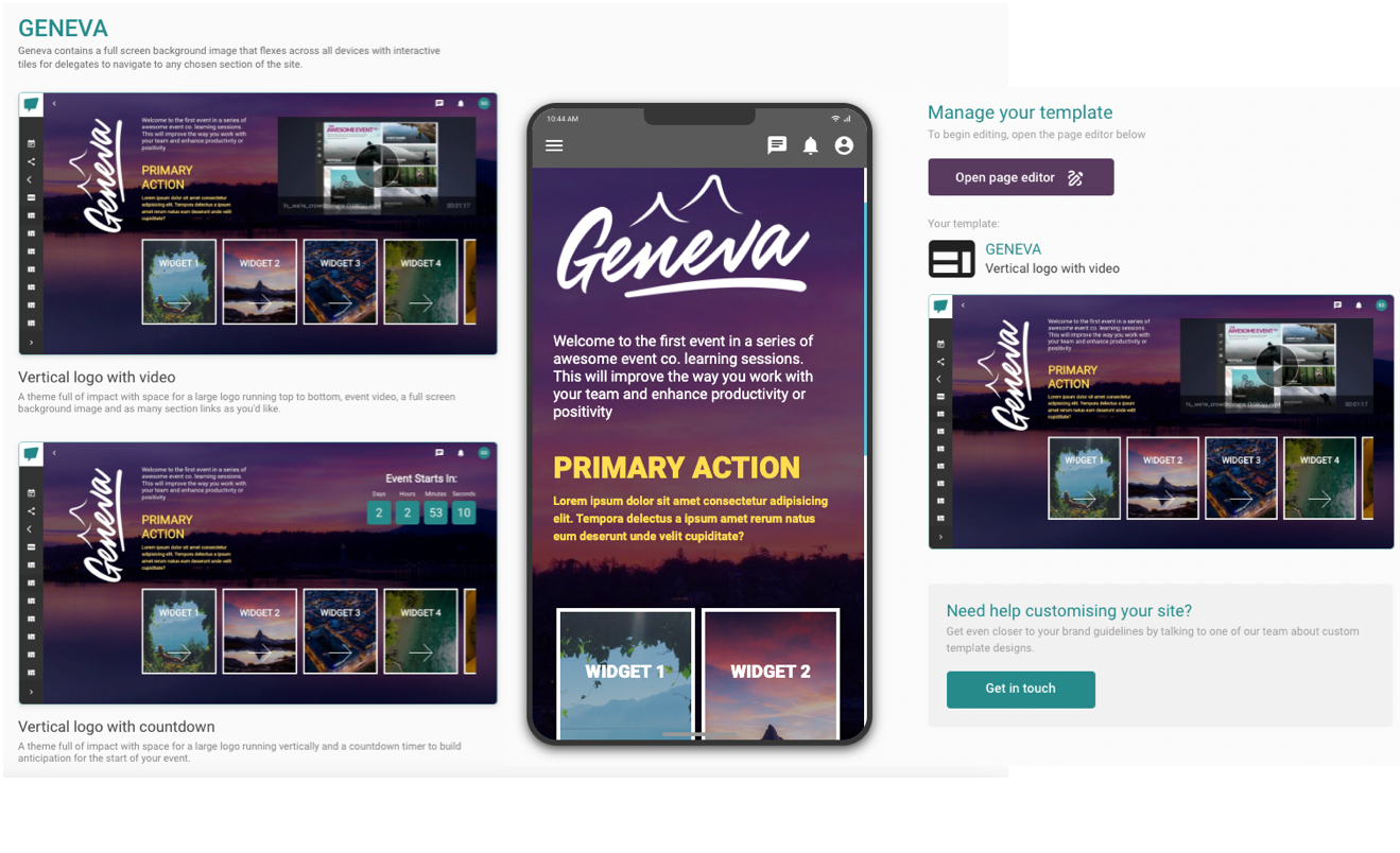
Geneva
- In general, Geneva contains a full screen background image that flexes across all devices with interactive tiles for delegates to navigate to any chosen section of the site.
- There are four different variations for you to choose from:
a. Vertical logo with video
b. Horizontal logo with video
c. Vertical with countdown
d. Horizontal with countdown
Vertical and Horizontal Logos with Videos
- On these templates, you can add a background and header image which will appear as your logo.
- The logo will appear as vertical or horizontal depending on the template that you choose.
- You can add an introduction to your page which will appear as a long section of content covering multiple lines at the top of the page. You can also set the text colour of your Introduction.
- You can then link a video, which you must first upload to your Video Library bank in the Dashboard. To find out how to do this, click here.
- On these templates, you’re able to add a Primary Action. Essentially, it is a short block of text which you can link to a different Module within your Event App. For example, you can add ‘Check out clips from last year’s event’ and link this text to your Video-on-Demand module page. You can also set the text colour of your Primary Action to make it pop!
- Finally, you can add an unlimited number of widgets to your page. For each widget, all you need is the name, an image, and a link to another Module within your Event App.
Vertical and Horizontal Logos with Countdowns
- Similar to the above, on these templates, you can add a background and header image which will appear as your logo.
- The logo will appear as vertical or horizontal depending on the template that you choose.
- You can add an introduction to your page which will appear as a long piece of content covering multiple lines at the top of the page. You can also set the text colour of your Introduction.
- To add the countdown timer, add the date and time that you want the timer to count down to. For example, this could be the date and time of your event. If you leave these fields blank, it will automatically default to your Event App start date and time.
- On these templates, you’re able to add a Primary Action. Essentially, it is a short block of text which you can link to a different Module within your Event App. For example, you can add ‘Check out clips from last year’s event’ and link this text to your Video-on-Demand module page. You can also set the text colour of your Primary Action to make it pop!
- Finally, you can add an unlimited number of widgets to your page. For each widget, all you need is the name, an image, and a link to another Module within your Event App.
California
- California contains a flexible grid of tiles with image backgrounds, clear calls to action and standout labels for a clean and simple home page.
- There are two variations of this template for you to choose from:
a. 1x4 hero grid
b. 2/4 hero grid
1x4 Hero Grid
-
On this template, you can add a background and header image which will appear as your logo.
-
You can then add an introduction to your page which will appear as a long piece of content covering multiple lines at the top of the page. You can also set the text colour of your Introduction.
-
Finally, you can add up to four widgets to your page. For each widget, all you need is the name, an image, and a link to another Module within your Event App.
2/4 Hero Grid
- On this template, you can add a header image which will appear as your logo.
- You can then add an introduction to your page which will appear as a long piece of content covering multiple lines at the top of the page. You can also set the text colour of your Introduction.
- Finally, you can add up to six widgets to your page. For each widget, all you need is the name, an image, and a link to another Module within your Event App.
 Sahara
- Sahara offers a collection of blog-style information pages that can be used for blog posts, info booths and help desk pages.
- There are two variations of this template for you to choose from:
a. Info Page (Showcase)
b. Info Page (Minimal)
Info Page (Showcase)
- On this template, you can add a Hero image and an overlay colour on the image, which will appear as the background header at the top of the page.
- You can then add a title and a description as well as taglines, which will appear on top of the background image at the top of the page.
- You can add sections in the content area of the page. For each section, you need a Section Label and content, which you can add to the rich-text editor field.
- You can also play around with the colours, including the background, content call-to-action background and call-to-action colours.
- In each section, you will also be able to add a call-to-action button with your own bespoke text and a deep link to link the button to a specific Module within your Event App.
Info Page (Minimal)
- On this template, you can add a Hero image and an overlay colour on the image as well as a text watermark which will appear as the background header at the top of the page.
- You can then add an Icon image, a title and a short description which will appear after the background image at the top of the page.
- You will be able to add sections in the content area of the page. For each section, you need a Section Label and content, which you can add to the rich-text editor field.
- You can then add Sidebar Widgets to your page. For each widget, all you need are the content tag, colour, an image, a heading and a short description. You can also link your widget to a Module within your Event App.
Monsoon
- Monsoon offers a collection of listing pages designed to provide an alternative view and to link to other content.
- There are two variations of this template for you to choose from:
a. List
b. Grid
List
- On this template, you can customise the header with a Hero image and an overlay colour on the image, which will appear as the background header at the top of the page.
- You can then add a title and a description which will appear on top of the background image at the top of the page.
- You can add a list of items in the content section of the page. For each item, you need a title, an image, a short description and a content tag. You can also personalise the colour of the tag and its background.
- You can then add up to three resource images to the list.
- You will be able to link each item to a specific Module within your Event App.
Grid
- On this template, you can customise the header with a Hero image and an overlay colour on the image, which will appear as the background header at the top of the page.
- You can then add a title and a description which will appear on top of the background image at the top of the page.
- In the content section of the page, you can add a list of items, which will appear on your Event App in grid view. For each item, you need a title, an image, a short description and a content tag. You can also personalise the colour of the tag.
- You will be able to link each item to a specific Module within your Event App.
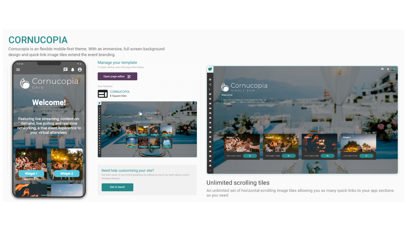
Cornucopia
- Overall, Cornucopia is a flexible mobile-first theme. With an immersive, full screen background design and quick-link image tiles to extend the event branding capabilities.
- There are two variations of this template for you to choose from:
a. Eight square tiles
b. Unlimited scrolling tiles - On these templates, you can add a background and header image which will appear as your logo.
- You can then add a title and a message, which will appear at the top of the page. You can also set the text colour of these components.
- Finally, you can add either an unlimited number or eight widgets to your page depending on the template that you choose. For each widget, all you need is the name, an image, and a link to another Module within your Event App.
Iconic
- Iconic is the classic mobile-first, device-agnostic home page. With an embedded icon picker for a fast and simple way to build an accessible home page for all.
- There are two variations of this template for you to choose from:
a. Simple squares
b. Enhanced squares - On these templates, you can add a background and header image, which will appear as your logo.
- You can also add up to ten widgets to your page. For each widget, all you need is the name, an icon (which is easily accessible from the icon picker), and a link to another Module within your Event App.
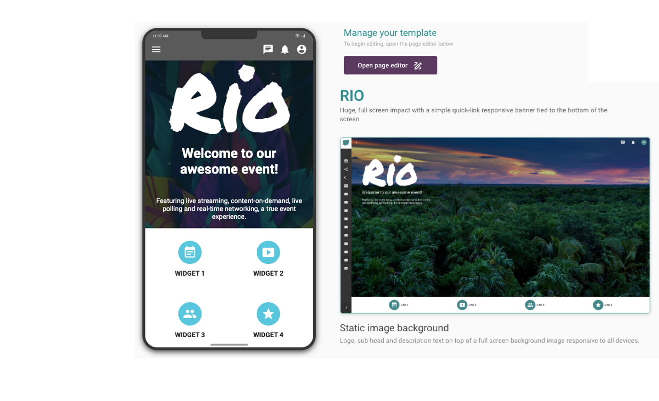
Rio
- Rio offers a huge, full screen impact with a simple quick-link responsive banner tied to the bottom of the screen.
- There are two variations of this template for you to choose from:
a. Static image background
b. Full background video
Static Image Background
- On this template, you can add a background image and a header image which will appear as your logo.
- You can then add a heading and a description which will appear at the top of the page. You can also set the text colour of these components.
- Finally, you can add up to six widgets to your page. For each widget, all you need is the name, an icon (which is easily accessible from the icon picker), and a link to another Module within your Event App.
Full Background Video
- On this template, you can embed a video from a third-party platform such as Vimeo or YouTube.
- You can also add a header image which will appear as your logo.
- You can then add a heading and a description, which will appear at the top of the page. You can also set the text colour of these components.
- Finally, you can add up to 6 widgets to your page. For each widget, all you need is the name, an icon (which is easily accessible from the icon picker), and a link to another Module within your Event App.
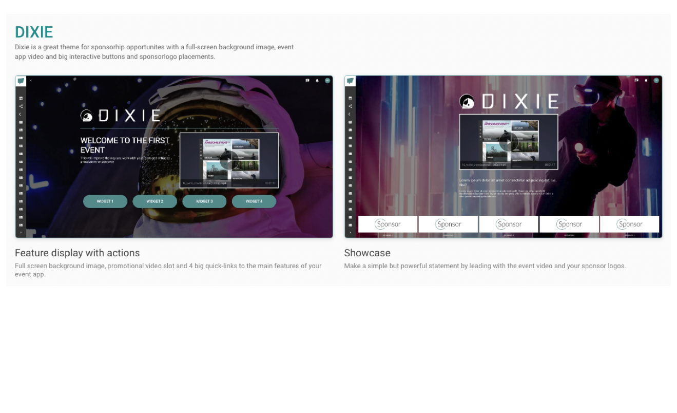
Dixie
- Dixie is a great theme for showcasing sponsors with a full-screen background image, event app video and big interactive buttons and sponsor logo placements.
- There are two variations of this template for you to choose from:
a. Feature display with actions
b. Showcase
Feature Display with Actions
- On this template, you can add a background and header image which will appear as your logo.
- You can then add an introduction and a description which will appear in the middle of the page. You can also set the text colour of these components.
- You can then link a video, which you must first upload to your Video Library bank in the Dashboard. To find out how to do this, click here.
- Finally, you can add up to six widgets to your page. For each widget, all you need is the name and a link to another Module within your Event App.
Showcase
- On this template, you can add a background and header image which will appear as your logo.
- You can then add a description title and a description which will appear as a long piece of content covering multiple lines. You can also set the text colour of these components.
- You can then link a video, which you must first upload to your Video Library bank in the Dashboard. To find out how to do this, click here.
- Finally, you can add up to four sponsor logos to your page. For each logo, all you need is the name of your sponsor, their logo and a link to another Module within your Event App.
Workspace
- The Workspace template fits perfectly as a Home Page for your internal comms hub.
- On this template, you can set a background colour to the page and add a header logo, which will appear at the top of the page.
- You can then add a section to appear as a vertical banner to the left of your page. All you need is to add a title and a subtitle and pick a colour.
- Next, you will be able to add widgets which will appear as a collage of grids on your Home Page.
- To add a widget, you will need a label to appear as a title, a short description, an image, an icon, and colours for the background and text.
- You will be able to link each widget to a specific Module within your Event App.


