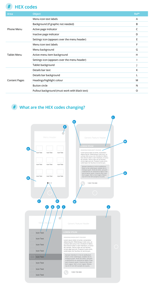
Elements Design Requirements
Below is a full list of design specifications for the Entegy Platform:

Below is a list of possible places the hex code can be changed and where this displays on the platform:
- 720 x 1600px PNG
• No transparency
• 520px clear space at top
- One graphic gets used for all devices. This means it gets cropped for smaller screens. The background gets cut from the top (it is always anchored to the bottom).
- It is recommended to avoid busy or high contrast in any background pattern or image to ensure legibility of menu item labels that will appear over the top.

- 720 x 300px PNG
• Transparency optional
- This image will require 50px of clear/safe space at the top for the Android notification bar overlay.
- The header sits over the top of the background, so it can utilise transparency.
- The update cog sits in the top right-hand corner, you can adjust the colour, but it cannot be moved.

- 1125 x 604px PNG
• Transparency optional
- This image will require 135px of clear/safe space at the top for the iPhoneX status bar overlay.
- The header sits over the top of the background, so it can utilise transparency.
- The update cog sits in the top right-hand corner, you can adjust the colour, but it cannot be moved.
- If you don't supply a tall menu header, the system will use the small header. If this occurs, the status bar will use the content page detail bar background colour.

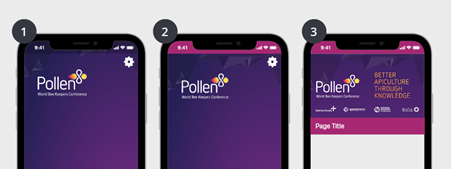
Example of the two header types on the iPhoneX:
- Screen one shows the tall asset, extending behind the status bar (a dark overlay is automatically added)
- Screen two shows the result of only uploading the stand 300px high header asset, using the content page feature bar colour behind the status bar
- Screen three shows the content page with the feature bar background colour set
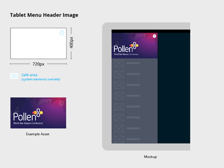
Tablet screens
Tablet screens are made up of a header graphic and a flat colour behind the menu.
- 720 x 400 px PNG
• Transparency optional
• Phone header will be used if not supplied
Help your attendees easily find what they are after. Clear icons can improve the usability of your app. We have created a few sets that we encourage you to use or refer to, they contain a wide range of icons which cover the needs of most event apps.
- 171 x 128 px PNG
• Transparency optional
- Our templates contain solid and line versions. They have been setup in Adobe InDesign which means a master page controls the background, and object & paragraph styles control the individual icons – meaning you can change all 100+ icons in a few minutes.
- Menu icons are always loaded from left to right, top to bottom on phones and top to bottom on tablets.
- Menu icon names are created in our CMS Core. They can be renamed and rearranged at any time.
- Core has four default icon sets that can be tinted any colour to match your app design

Generic header & feature headers
These appear above content pages. A generic header appears throughout the app, but can be replaced for any page independently at any time allowing you to really add focus and functionality to each page.
Generic Header / Feature Header
- 720 x 405px PNG
• No transparency
- Allow 74px clear space at top back button (iOS) and system icons (Android).
- A generic header is needed as a default throughout the app. Feature headers can be loaded above any content page, this will replace the generic header.
